The CEO Echo is the first data interpretation service of our new metrics bot. Automatic interpretation texts are the future of "Analytics". Who wants to know why and how they can look like - here it is. Again, the best is saved for last: the first issue of the monthly CEO Echo.
"Analytics"- a maze for all non-experts (who earn the money that Analytics costs).
Who hasn't experienced this? You just want to know how well a digital marketing measure or campaign has performed.
You ask the internal data guru or an external analytics missionary - and then this: the answer comes in completely incomprehensible technical jargon (in English). It is garnished with extremely pretty diagrams, sometimes entire dashboards and the concluding cordial invitation to an internal training session. In the appointment, you are supposed to learn where to look in the "dashboard" to find an answer to the question that you have long forgotten by then. Everything clear?
Diagrams and dashboards - pure window dressing
What analytics experts cannot understand: apart from themselves, very few people can read complex statistical diagrams. The transfer effort, the translation in the head, is simply too high when "reading". Reports and dashboards are too exhausting, the reception takes far too long. And nobody gets as far as interpretation, the preliminary stage of decision-making, which is what all the data hoarding is really about.
So the data has to get to the people. Absolutely right, but the usual recipe is to make fancy "reports" and "charts". Everyone who regularly presents to management knows that such data visualizations generate a lot of effort and little benefit. If you want to understand charts there, in management, you have to make it brutally simple, at kindergarten level . This is not due to lack of intelligence, but only to differently directed attention.
"Sales data? Okay, a maximum of five columns on the chart! The The last two also need the green arrow in between, you know, from bottom left to top right. And then above that you write: "Sales: +16%"."
Which brings us to the message. The message of this sales chart is in the text. In a comment, in the headline, in a text element added by hand, in anything, but not in the visualization. So why have a chart or dashboard at all?
The dashboard message: "Everything is under control".
Well, it visibly shows that the company has control over the visualized overall situation. "We continuously measure our turnover". This message is correct and very very important. However, it is all there is to it. End of the visual message. Zero Decision Support. Everything else, a comprehensive understanding of the data and even more so its interpretation, needs text, written or spoken words, especially in well-managed meetings.
To enable people to make decisions, language (text) is the key. Text opens doors to data that were previously closed. With text, you reach far more people for data-based messages. And with text, those messages can also be far more substantial than in "under-complex" management slides.
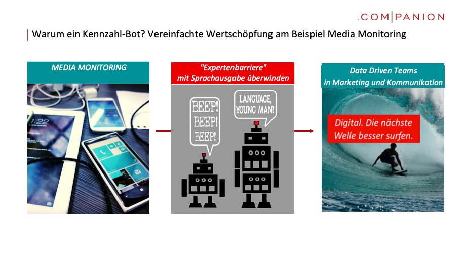
Key figure bots - overcoming the expert trap with simple texts
"Data only speaks when you talk about it." We have taken our own guiding principle for data-based decisions seriously and programmed a KPI robot that fully automatically analyzes and interprets data and transforms it into easy-to-read interpretation texts. It is an artificial intelligence, so it can recognize patterns and react to them.
What our KPI bot, internally called "KPI Guy", can do, we show with the example of our new CEO-Echo. CEO-Echo is a free evaluation of the digital media presence of all CEOs from DAX and MDAX companies.
Subscribe now: The monthly CEO Echo - how present is my CEO?
In CEO-Echo, the .companion Kennzahl-Bot examines and interprets data from the media monitoring market leader Talkwalker. Our metrics bot continuously examines and compares the digital media echo on all DAX and MDAX CEOs. All content in German and English that is publicly accessible on websites, in forums and in social media is measured and analyzed worldwide.
The text and content of the CEO echo are generated fully automatically by the companion metrics bot, which can also interpret any other marketing and communications data fully automatically.
What's in the CEO echo?
The CEO echo includes
- 4 public rankings of all CEOs studied (we only publish rank 1, see below for an example)
- a non-public individual evaluation of your CEO. It contains additional statements on tonality, authors and reader activation. We will be happy to send you the individual evaluation personally. To do so, please send a short message to contact@companion.de.

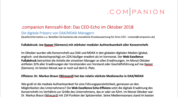
Here the October issue (pdf, public part)